

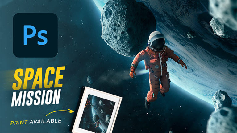
Do you wanna bring your Photoshop compositing skills to the next level?
well, if you follow the 5 techniques that i’m about to show you today and implement them, it’s gonna make a big difference in the quality of your compositing
Are you ready to learn my photoshop compositing secrets?
Most Beginners start with Photoshop compositing Without a good foundation and the fundamentals behind creating a realistic composite, That is why we often see bad Images that Lacks the essential Parts to a believable composite such as matching the right perspective, luminosity, shadows, and focal length
Compositing images in Photoshop can be frustrating if you don’t understand what makes an image look realistic and this might have happened to you in the past when you are working on a composite and you have a subject and a background and it feels off and something is wrong but you can’t really tell why that’s because it is probably lacking one of the core fundamentals that I’m going to talk about today in this comprehensive guide
i will walk you through the essentials behind a Realistic composite in Photoshop and the mistakes to avoid when creating your composite image, and you will learn some valuable photoshop compositing techniques along the way
if you’re new to this, don’t worry I will try to cover everything you need to know about Photoshop compositing essentials and explain it to you as simple as possible, so let’s start by defining what is image compositing in Photoshop
What is Photoshop compositing?
Photoshop compositing is taking multiple images from separate sources and then combining them into one single image in photoshop to create a complex composition that often cannot be achieved otherwise or to create a fantasy image from an artistic point of view
and there are many types of compositing, the most known types are frame compositing and element compositing
Frame Compositing
Frame compositing is combining multiple images together that were shot in the same scene, for instance, this type of compositing is known to create images that are hard to achieve in one single shot and you need to shoot in different steps and then combine them in photoshop for example, images that are created for commercial and advertising purposes, the image below is a beverage ad composite that was created by combining multiple frames together


Source Mastering Photoshop Compositing For Advertising
Element Compositing
Element compositing is taking different images that were shot in different locations and combining them together in Photoshop to produce a unique image that often is a fantasy and imaginary
Here is an example project that I created a while ago, and I actually have a photoshop compositing tutorial on how to create this from scratch using stock images and you can learn more about it here
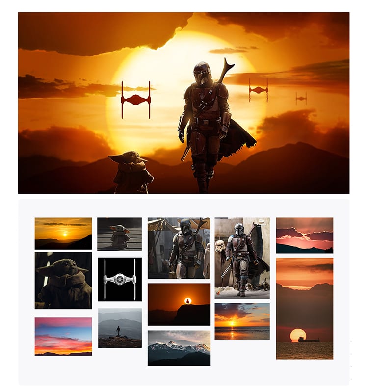
and another example of element compositing in action

Source MhPekster

Now that you have seen some photoshop compositing examples and have an idea of the types of compositing, let’s talk about what makes a composite believable and what are the tools and the techniques behind a successful composite
1 – Choosing the right images
When it comes to choosing your images this part is crucial and it’s the most important part of your composite, if you choose the wrong images then no matter what changes you make to it, it won’t look realistic
Using stock images
it’s possible to use stock images in your compositing projects as long as you pick the right ones and follow the essential guidelines which i will go into more detail further in this article you can choose from a big collection of stock imagery websites these websites are an extremely valuable resource, not only for compositing but for people across the globe who are interested in design.
Stock image websites contain an extensive library of high-quality images, graphics, and often videos. The majority of images that you can source from stock image websites are royalty-free, which means that you can use them anywhere without having to credit anybody. When you use stock images you can also edit them to your likening and even distribute them in marketing campaigns — they’re perfect for commercial purposes. When you’re searching for stock images you’ll need to choose between two different options; free stock image websites and premium stock image websites.
Both premium and free stock image websites have advantages and disadvantages which you’ll need to take into consideration when you’re using them in your projects. I have highlighted some websites to consider when you’re choosing which option is the best fit for your project.
Premium stock images websites:
Envato Elements has Millions of Downloads: 2,000,000+ Photoshop Brushes, Freebies, Photoshop Actions, Stock Photos & Design Assets, (Perfect for compositing)
Free stock images websites:
textures.com is a well-known website among designers that offers digital pictures of all sorts of materials, pictures of fabrics, wood, metal, bricks, and many more
Shooting Your Own images
The second option is to shoot your own images and I consider the best option because you have much more flexibility and control over the lighting, perspective and Focal length once you have all of your images collected and ready it’s time for the post-production part In Photoshop when you are going to bring all of your images together and combine them to produce one image and in this process, you need to consider some really important and fundamental rules in mind in order to do it right and produces a realistic and believable image
2 – How To Match perspective in Photoshop
The second most important thing that comes after choosing the right images and I consider crucial and the key to a successful composite is perspective matching The most common mistake that beginners make in their composites is that they don’t match perspective when they are placing their subject Into another image Which leads to a weird looking image or the subject is looking like it’s floating
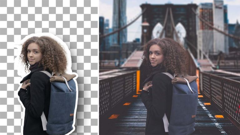
Let me give you an example to show you what I’m talking about I have an image right here of my subject that I want to put it in another background And if I were to place it in this image without matching the perspective it would look weird and wrong, Now in addition to the importance of picking the right image that will work for your subject, perspective is also very important in order for your composite to look realistic

So to fix this we need to match the perspective by finding the horizon line, and if you don’t know what is a horizon line basically it is a horizontal line that runs across the image frame to represent the viewer’s eye level, or delineate where the sky meets the ground and the best way to find it is looking at the original image And you can see it highlighted in the image below, once you determine the horizon line you can use it to match the horizon line of the other image And you can see that just by doing that the image looks a lot better

and the last thing is to add the color correction and shadows to make it look realistic

another very important factor that goes with perspective is scale
if you decide to resize your subject you need to resize it in perspective by keeping the anchor point of the free transform tool in the horizon line and scale based on the horizon line
Now with that being said, this is not the only way to match perspective there is many types of perspective and sometimes it’s a little bit hard to find the horizon line
So let me introduce you to the point perspective where to find it and how to match it with your subject
The one-point perspective
One point perspective gets its name from the fact that it utilizes a single vanishing point, I’m sure you have seen it in many images before And it’s simply how things appear to get smaller as they get further away, converging towards a single ‘vanishing point’ on the horizon line and you can find your vanishing point in this type of perspective by following the What’s known as the “ leading lines” Found in things like buildings and Street

The two-point perspective
Two-point perspective occurs when you can see two vanishing points from your point of view and it’s most commonly seen in buildings and architecture.

The three-point perspective
the biggest difference in a three-point perspective is that there are three vanishing points. Two are along the horizon, just like two-point, but the third is located either above the horizon or below the horizon,

Now this may seem complicated to you if you’re just starting out But it’s really not, all you need to know is that you should Match your subject with the horizon line and scale your objects with perspective But this time you should match your Anchor Point to the vanishing point
Are you scaling your subjects within perspective?
Perspective is One Of The Most Important Aspects Behind A Realistic Composite in Photoshop
3 – Matching focal length
In addition to matching perspective you want to make sure you match focal length as well for instance if your background was taken with a very wide-angle lens, you wanna make sure to photograph your subject with a wide-angle lens as well if your background was taken with a telephoto lens you want to make sure you photograph your subject with a telephoto lens but if you are using stock images and you don’t have the time or the budget to shoot your own,
then you want to make sure to pick the right images And match the focal length as close as possible, That being said you can also fix perspective and focal length in Photoshop using perspective warp and vanishing point
4 – Matching luminosity
In order for your composite to look realistic, you have to match the lights and shadows and that’s by putting your subject in a closer environment to your background to match your background lighting conditions for instance if the background was shot outside on a bright sunny day make sure to take your subject outside in a bright sunny day That way the light is going to be very similar and at the same direction
this is the first step and the most important one because if a composite didn’t work in black and white and the luminosity is not matching then it won’t work in color no matter what correction you do because the foundation is wrong if you are only using stock images you need to do your research and pick the right images otherwise your composite is not going to look believable and even when you got your subject very close to the background you still have to do some color matching and luminosity matching,
and if your eyes are not trained you’re not going to do a great job at this process, that’s why the check layers Are very helpful in these situations
What are check layers?
Check layers are temporary adjustment layers created to check the luminosity, color, and saturation values between the images that you’re going to composite together, and then you can make adjustment decisions based on these values
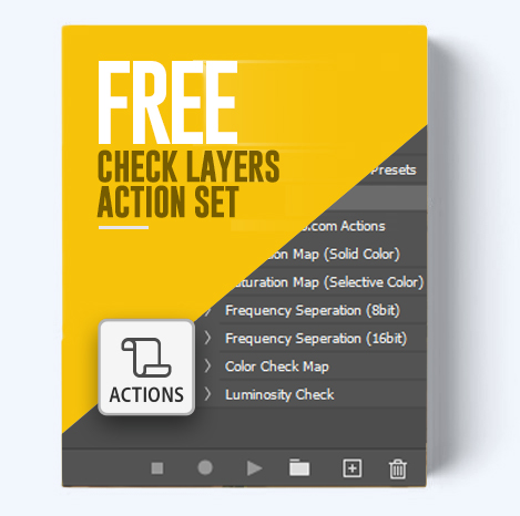
this may sound complicated but it’s really not once you understand how it works you will get the hang of it, plus you can download my check layer action set down below, and you will be able to do this with one click
So let me show you how to use the Luminosity check layers to match the light values between your images
How to use the luminosity check layers
I’m going to show you an example here to help you understand it better, In this case, we have a picture of a mountain and i want to replace the sky and add more Mountains in the background, So the first thing i did is remove the background and I used color range to do it

Next, i added the new sky, Remember to choose an image that has a similar perspective and light Direction

And to match the Luminosity we need to first eliminate color and focus only on the light values By adding the first check layer which is a black and white adjustment layer Or by adding a black fill and changing the blending mode to color

So clearly now we see that the sky is very dark compared to the original one, A good rule of thumb here is that you should always make your Sky Slightly lighter than the ground because the sky is going to be the light source, and obviously the brightest thing is going to be the sun,
then the sky, and the sky Is it going to serve as a light source and lights up the ground, Now you can look at this image and make a guess and make the sky brighter than the background
and you can get it pretty close but there’s a tool that can help us analyze the light values more accurately And that’s the threshold Adjustment layer, this adjustment layer is similar to the levels adjustment layer when you move the slider to the right it makes the image lighter
and when you move it to the left it makes the image darker And that will help us better analyze how the light travels through the image And make adjustments based on that So now when I drag the slider from the right to do the left the first thing that is going to show up is the left corner and that makes sense because the Sun is on the left side, But you can see here that the ground is starting to show up and the sky is still not showing
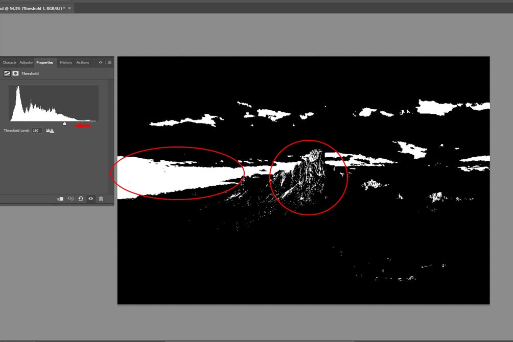
That means the sky is very dark and what we need to do next is make the sky brighter with the levels adjustment layer

Once you’ve done that the threshold slider should look something like this, The sky should be brighter therefore, the light should travel from the left corner where the sun is then through the sky then to the ground

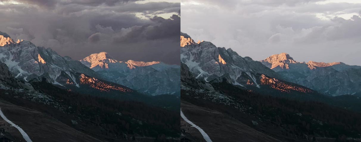
And now as you can see the composite now looks much more believable and better to the eye

And you can see the difference much clearer when you look at the edges before and after, When you look at the mountain in the background you can see that it’s lighter than the mountain in the foreground and that’s because of the atmosphere and the particles in the air reflecting the light in the distance, Therefore the sky should be lighter than the mountain not darker
And the next thing that I did is that I added some mountains in the background

Then I used the same technique again to match the luminosity, And because these mountains are further in the distance they should be slightly lighter than the previous Mountain

luminosity matching can make or break your Compositing in Photoshop
5 – Matching color
Color correction is also a very important aspect in compositing it can make or break your image, and because not all of us are color savvy sometimes it is a little bit hard to identify the problem with color in certain images that you’re working on, and because the second most common thing that beginners get wrong along with perspective is saturation that’s when color check layers can come in to help in many situations.so The first ones we are gonna talk about are saturation maps
How to use the saturation map check layers
This check layer will isolate saturation and will only show you saturation value in your image and by doing that you can really easily compare the two images And make adjustments based on the values that you see and match the two images together and you can create a saturation map in two different ways the first one is with a selective color adjustment layer, and as you can see in the example below,
our subject is more saturated than the background and to fix that what you need to do is create a selective color adjustment layer and reduce the blacks to -100 in all colors except for whites, neutrals, and black

then for whites, neutrals, and black, you need to increase the blacks to +100

Once you do that your image will look something like this, you can see clearly now that the subject is more saturated than the background

Now what’s left to is match the saturation with a hue /saturation adjustment layer

the other way of creating the saturation map is by creating a solid color then choose any color you want and then change the blending mode to luminosity
the color will look slightly different but the procedure of color correction is the same

How to use the color check layers
Now if you have experience in photoshop compositing and have done a lot of color correction before, most of the time you will know what needs to be changed and what type of adjustment layer it needs just by looking at the images, but sometimes it’s difficult to find the problem with color especially for beginners
in this example, we need to place this car in a new background, and you can that the color is not matching

and to figure out the problem and which color we need to target we can do a color check by creating a 50% grey color fill and changing the blending mode to luminosity, and you can do that by pressing SHIFT + BACKSPACE on a pc or OPTION + DELETE on a mac and choosing 50% grey from the drop-down and what that will do is show us a color map of the image and reveal all value difference,
after that, you can add a hue/saturation adjustment layer and increase the saturation to exaggerate the results and help us see the color difference between the subject and the background better
and by doing that we can clearly see the difference now and we know that we need to add some reds and yellows to the midtones and the shadows, but even if you don’t know what color to change just experiment with the sliders with a color balance adjustment layer and try to blend the subject with the background color

and when you do that the image should be the same or very close to the background color

after color correction, we can delete these check layers because we don’t need them anymore, and now as you can see the subject looks a lot more realistic and it’s blend in with the background much better

Now this is also not the only way to check colors in photoshop but i wanted to show you the easiest method to help you match color really easily
in summary here is a quick recap of the techniques that you learned today
- Choose the right images that have the same perspective and lighting conditions
- try to match the focal length when you’re shooting your images
- Put your subject in a closer environment to your background when shooting to match your background lighting conditions
- always use the perspective technique to match the perspective by finding the horizon line and the vanishing point
- Use luminosity check layers to match lights and shadows
- Use the saturation map check layer to match the saturation
- Use color check layers to easily match colors between your subject and the background
Did you find some great techniques to try in your next compositing project? What are the exciting things that you learned today, and how are you going to implement them?
Let us know in the comments.
here’s a tip you can use right now, Your composites will be vastly better if you implement the techniques that i showed you today, Go find some images and start compositing right now. i also have a free Photoshop compositing course that will show you how to implement these exact techniques to your images
then Come back here and tell us about the before-and-after. I bet you’ll have something to say!
If you enjoyed this post, I’d be very grateful if you’d help us spread the word by sharing it on social media. Thank you!


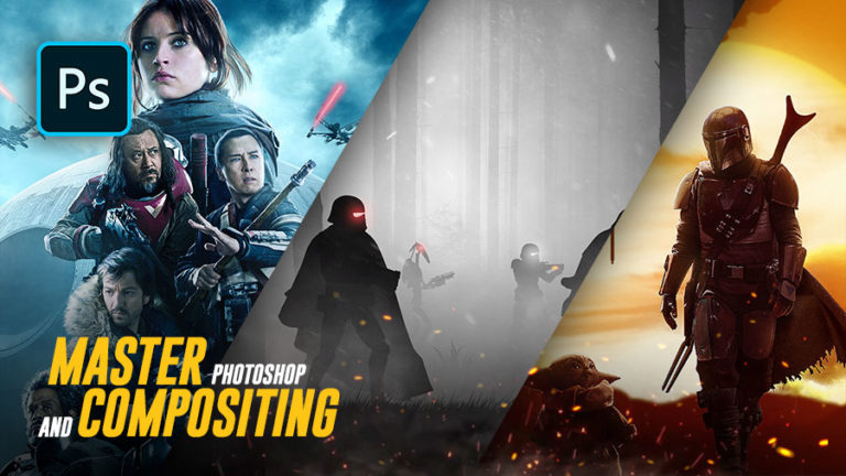
8 thoughts on “The Complete Guide To Compositing in Photoshop”
It’s really helpful. Hope share this as a tutorial in YouTube sir. This will help a lot newbies like me🙂. Thanks for making more advance in photoshop techniques.
Nice compositing ideas.. Thanks a lot
Do you change the setting of the blending mode for each adjustment layer?
Hey james, i don’t change the blending mode for every adj layer, it depends on what I’m trying to achieve, most of the time I change the blending mode to color if I’m trying to only affect color, and to luminosity if I’m trying to only affect luminance
hope that was helpful
Those 3 techniques to match light, saturation and colors are totally new to me. Thank you very much for sharing; I’ll be sure to apply them on my next composite.
Any thoughts on how to find out a horizon line where there isn’t one? For example: how can I match a person who was photographed in a studio on a solid color backdrop in a landscape picture?
You have to match the horizon line of the picture where the person is with the landscape’s horizon line, but how can you do it if there isn’t a horizon line on the person’s picture? How can you match the perspective?
Thanks in advance.
Hey laura, im afraid in that case there isn’t a way to easily find the horizon line unless you took the picture or you were present where the picture was taken and you know approximately where the horizon would be, but when you follow the techniques I showed in this tutorial on other composites and you do enough of them you will develop the skills to spot the wrong perspective just by looking at the image and without following these guidelines
I hope that helped, and good luck on your next projects
It’s really helpful and useful. Thanks a lot
you are welcome Yogesh